ShopDreamUp AI ArtDreamUp
Deviation Actions
Suggested Deviants
Suggested Collections
You Might Like…
Featured in Groups
Description
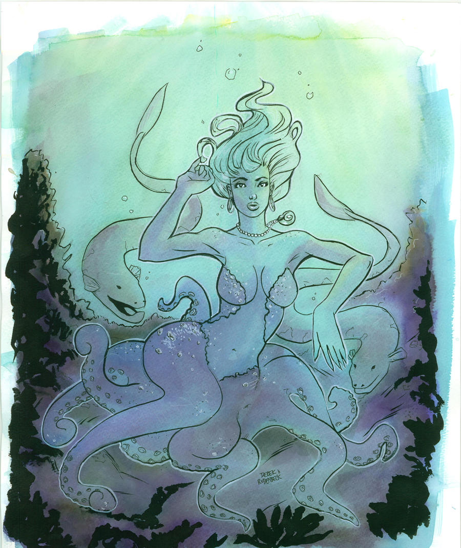
Felt like doing a sexy looking interpretation of Ursula from the little mermaid. Colors done with Dr. Martians and some other mixed media. Inks and what not. Let me know what you think, thanks!! Footnote the scan does not do the original justice. Either way I can see room for improvement.
(c) artwork Myself. Please contact me if you want to use. thanks!
(c) artwork Myself. Please contact me if you want to use. thanks!
Image size
4233x5030px 2.36 MB
© 2011 - 2024 DerekRodenbeck
Comments206
Join the community to add your comment. Already a deviant? Log In
At first, I didn't realize that this was Ursula until I read the description. Then I realized the similarity XD Oh my childhood...
That being said, I like the idea of younger Ursula and your approach to her design. Adding the eels was nice touch, and the seaweed drawn with ink brush is fun to look at. I like your style as well; simple but effective, it reminded me of the styles that comic book artists used during the 70s, which is not a bad thing at all! From the overall design, I could clearly see your vision and your intentions.
But, as always, critiques would be pointless without some pointers <img src="e.deviantart.net/emoticons/w/w…" width="15" height="15" alt="
1. The Style:
It's not the style itself that I am criticizing. As I said before, I like your style; it's simple yet effective, drawing characters with curvy lines, and using as few details as possible. On the other hand, this style is very difficult. It is very hard to use strong lines that can sufficiently describe the body parts they are portraying. When that happens, the line qualities become inconsistent, as I observed from your drawing.
Your line quality on Ursula's upper body is very nicely done; because of this, from her head to her stomach, anyone would be able to see that this is a sexy body, even without the colors or values. However, starting from her hip lines to her tentacles, the line qualities seems to get weaker. The lines are not as 'flow-y' as the lines from her upper body. Also, the lines for the tentacles are much less wavy, and much thinner.
2. The Atmosphere:
This could be my personal opinion, but Ursula in this artwork seems much more tame then her original counterpart. Sure, she looks sexy, but evil? Not really. You should consider changing her expression slightly, but that's up to you, not me.
Also, the colors seems a little washed and bland. Don't get me wrong; I like the color choices, it's just that I feel that if the value shift of light to darkness was more intense, the atmosphere would have been much more interesting.
Well, that's all I wanted to say. These are my humble opinions, and my intention is never to make you feel terrible, but hopely to help you improve even further. All in all, this artwork shows clear vision and intention of the artist. With slight readjustments, this would become even better piece. Oh, and it's a great tribute to the old Disney films. How I miss the Disney of my childhood...
Thank you for reading my long-winded critique.


